
Project Overview
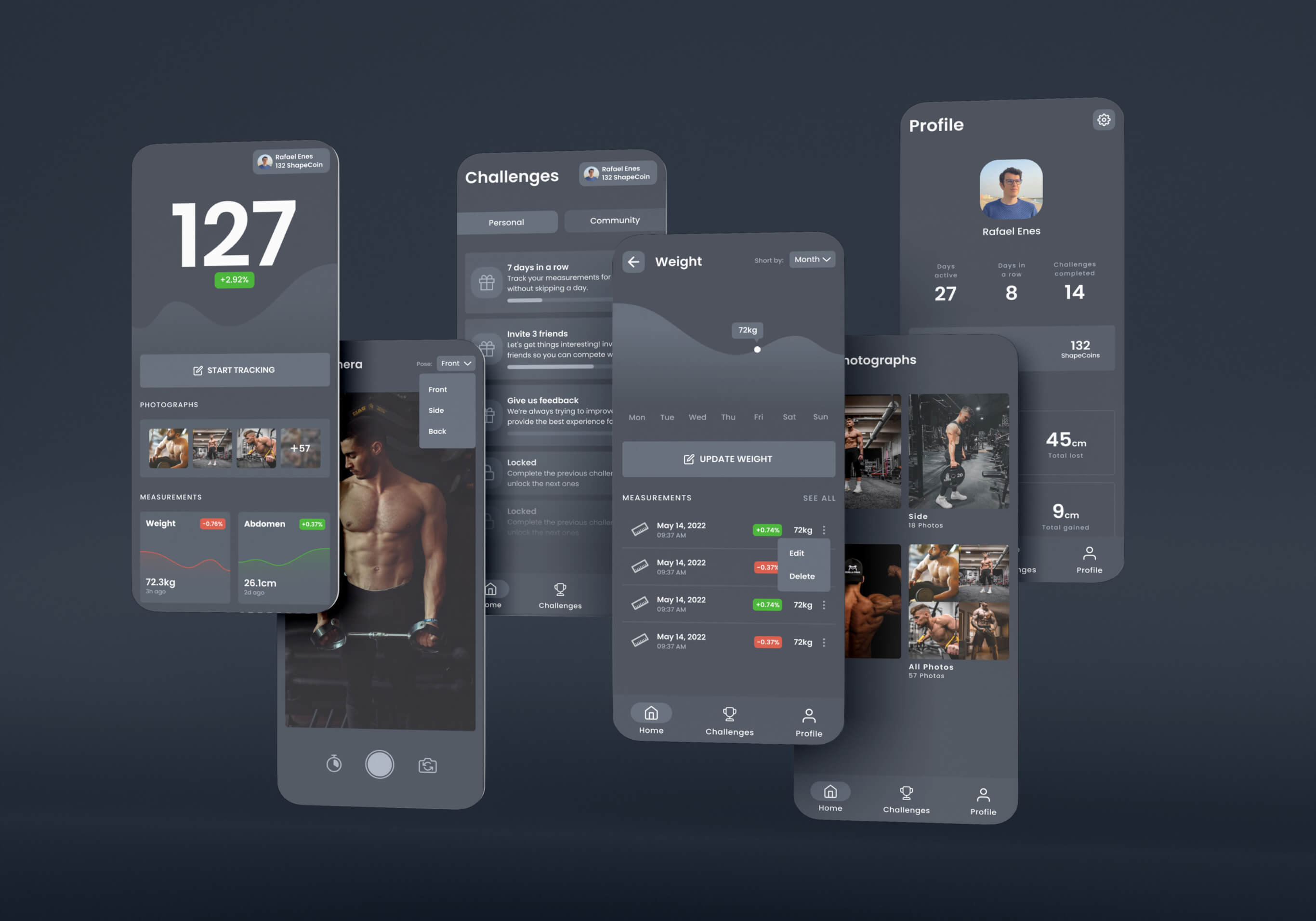
Shape route is a fitness tracker that helps people record their progress by capturing body measurements and photographs. Having a straight record of the body transformation allows users to see the constant improvement of their actions.
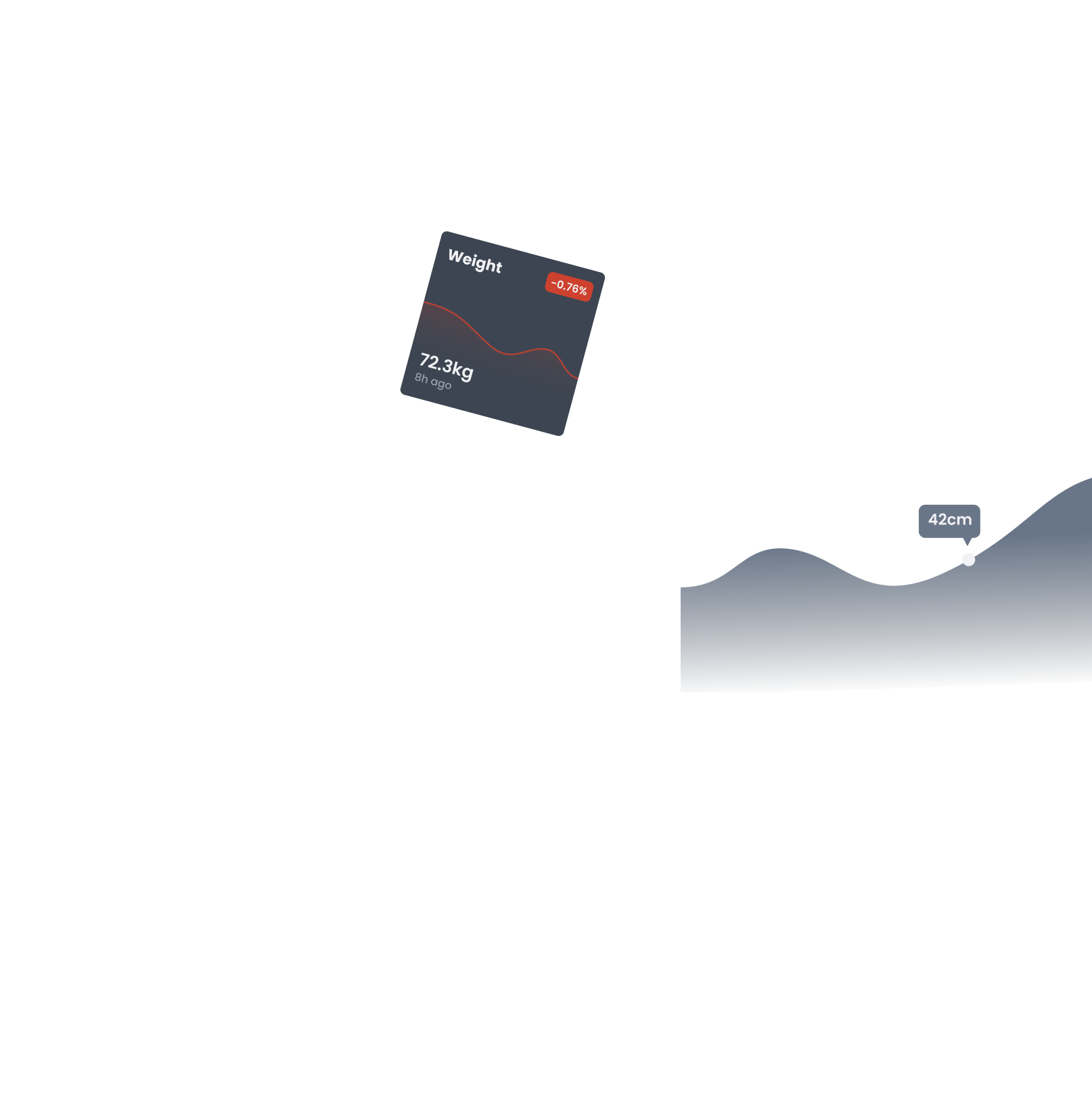
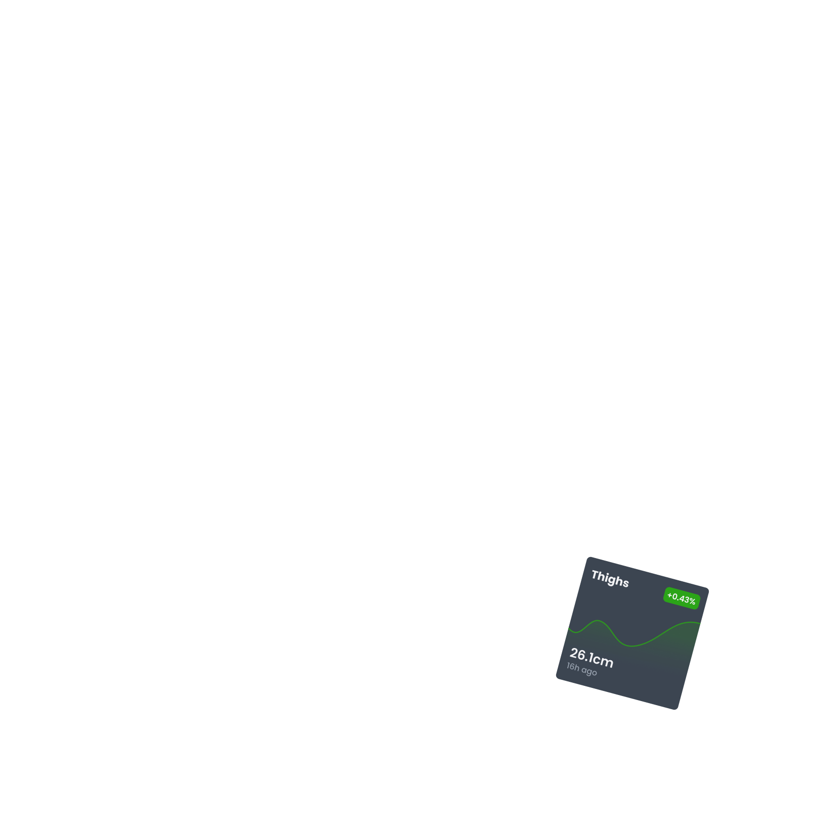
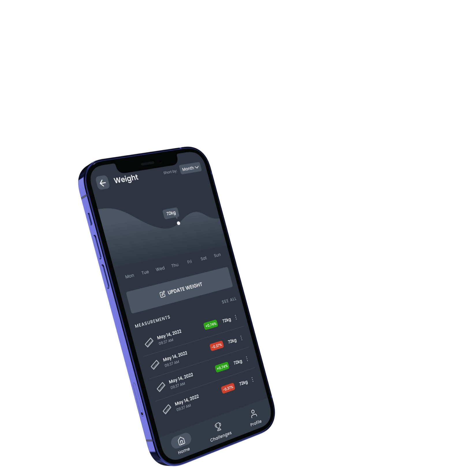
This app provides data about the user's body status and displays visual feedback about their current fitness plan, which is crucial in maintaining motivation throughout the process.
background
Most of the competitors in the fitness app space haven't invested in the app interface design. This lack results in poor user experience and usability problems leading to high churn rates and poor user engagement.
Shape route aims to acquire the users that abandoned those apps by offering a better user experience and functionalities. We've created a cryptocurrency named Shape Coin to reward active users and capture crypto enthusiasts that are also interested in fitness.
Most apps have critical usability issues
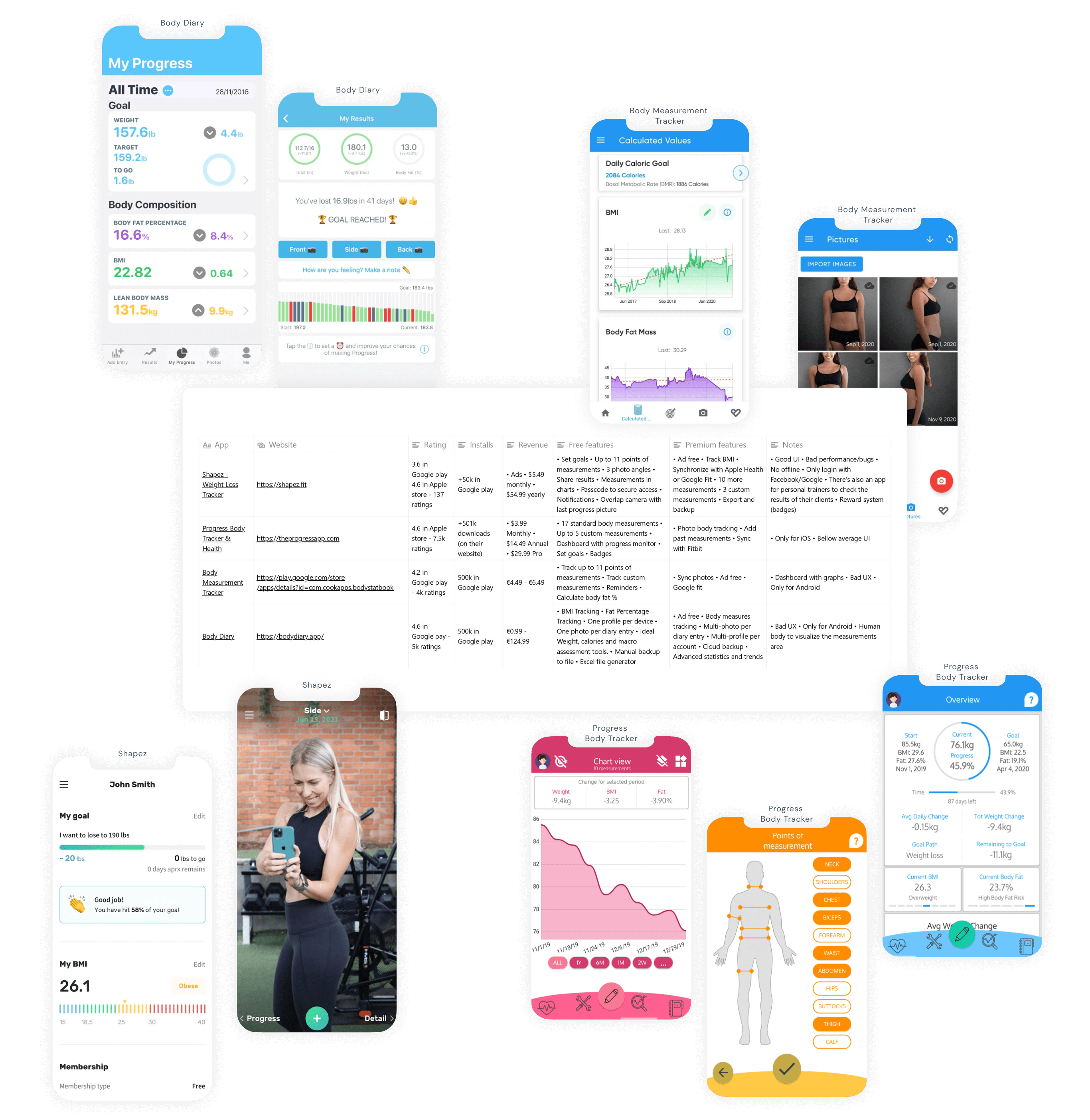
While researching our direct competitors, I've noticed that most apps are passion projects from one person and have critical usability issues. This fitness niche market isn't efficient and has space for new players to capture market share.
competition Key Takeaways
- Small niche without many strong players in the market.
- Most apps are one-person projects having execution problems that lead to performance issues.
- Free apps have a lot of ads that keep users away.
- Not modern and appealing user interface.
- Bad usability and user experience.
Learn from market competitors to avoid mistakes
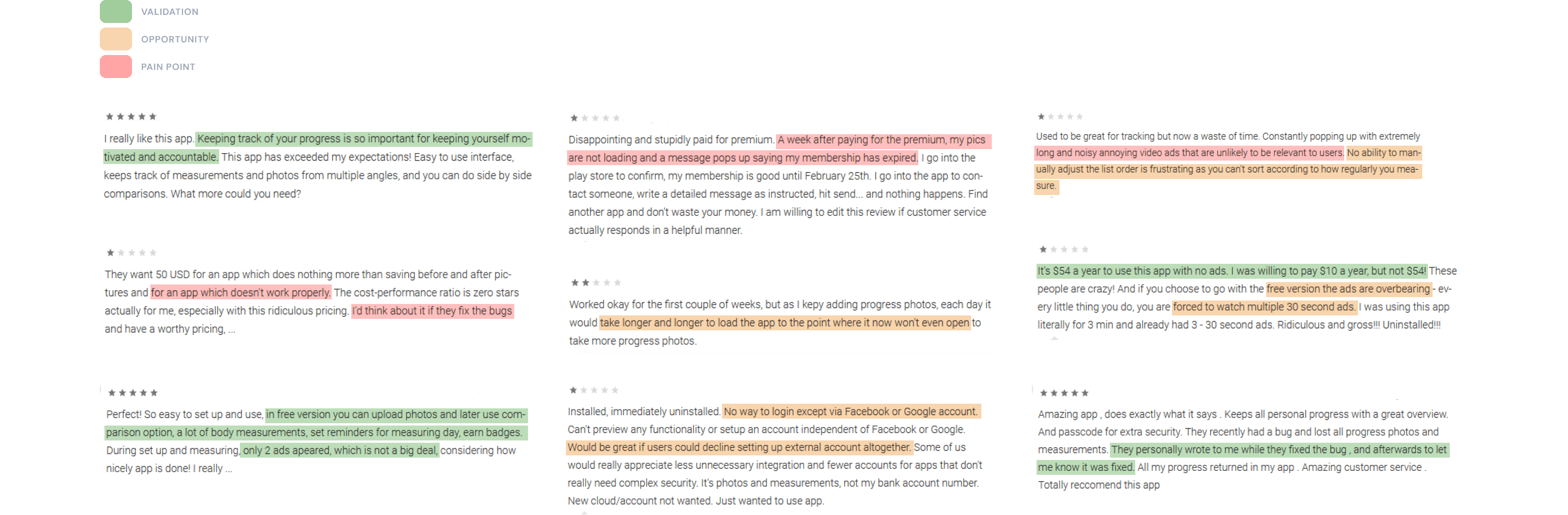
In the app stores, we can see all the user’s feedback. It’s a fast way to see the user’s experience. This allows for gathering information about their pain points, needs, and wants. All this information is relevant to later study opportunities in the market.
With this first research, we validated the concept and mitigated some risks. We had more certainty about the market need for a solution like this, and we got insights into how the competition solves the problem and the people’s reaction to it.
Insights about their feedback
- Bad code with bugs resulting in poor performance.
- Performance issues keep users away after the first try.
- Users want a solid solution to track their body progress.
- Users don’t care if it’s just a few ads if the app provides value.
- Customer service is a plus for maintaining user satisfaction.
- Users are sensible with sharing personal data.
Converting findings into actionable information
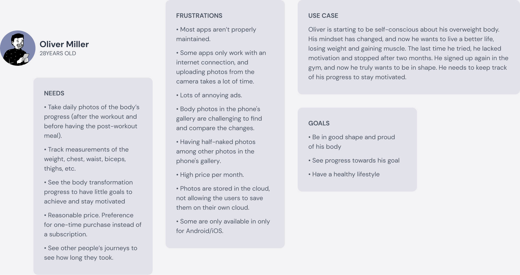
The feedback from the users helped determine the user's wants, needs, and pain points. At this time, we knew about the market competitors and the users. The gatherings were synthesized into user personas to understand better and a quick cheat sheet to recall design decisions.
Personas
The user personas gather all the information we collect across different formats. They act as a several post-it notes that accompany us during the design process. Having users in mind keep us user-centered until the end of the product life cycle.
Converting findings into actionable information
Before jumping straight to the drawing board to make wireframes, it's best to slow down and get an overview of the product. The flowcharts help anticipate the user paths throughout the entire app and plan how they'll execute their tasks.
Keeping the left side of the brain working is vital in this phase. Thinking logically about how to fulfill the user's needs and their jobs to be done.
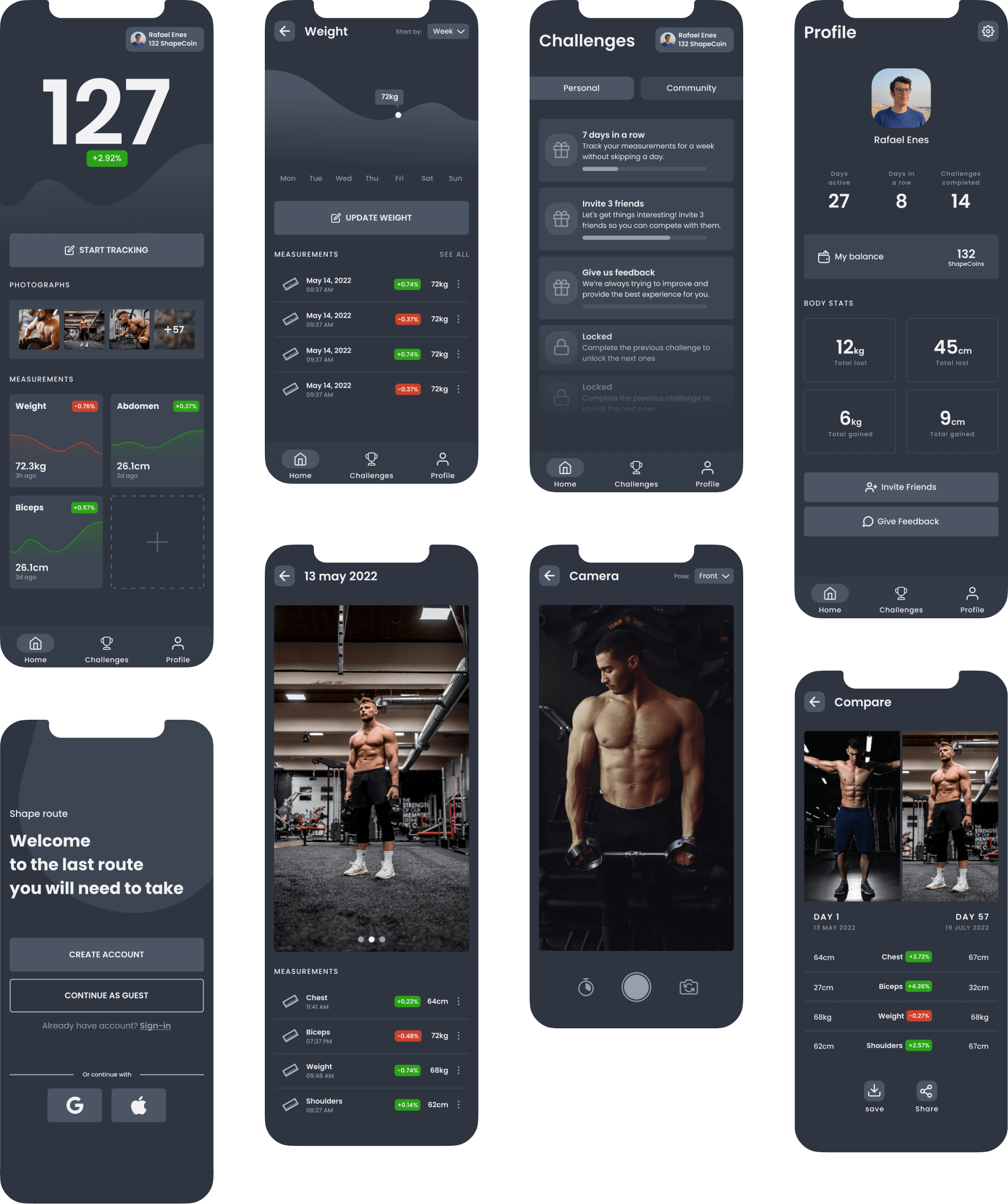
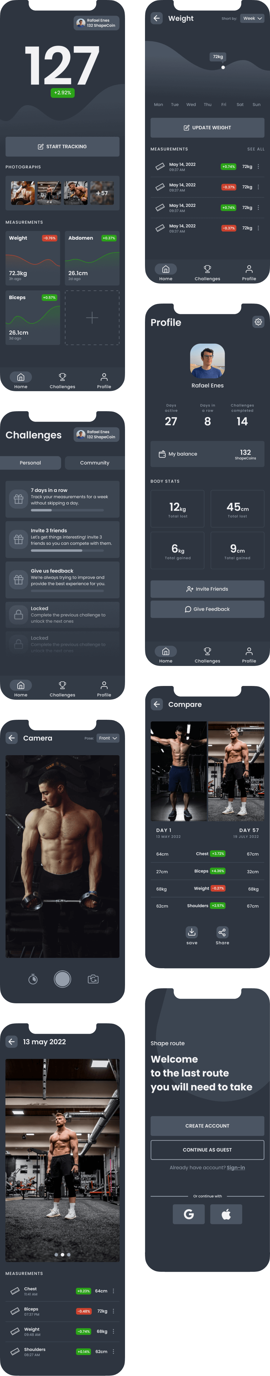
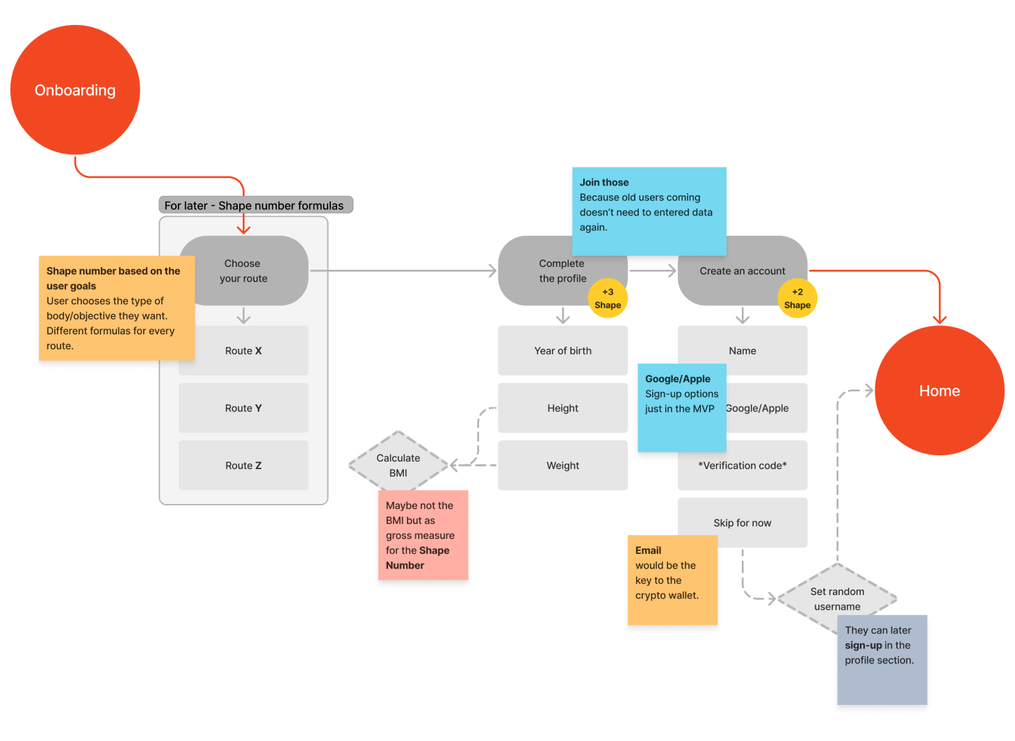
onboarding
Here is the first contact point between the users and the product. The key was to collect essential information to have some data to show to the user. We want to avoid showing empty states.
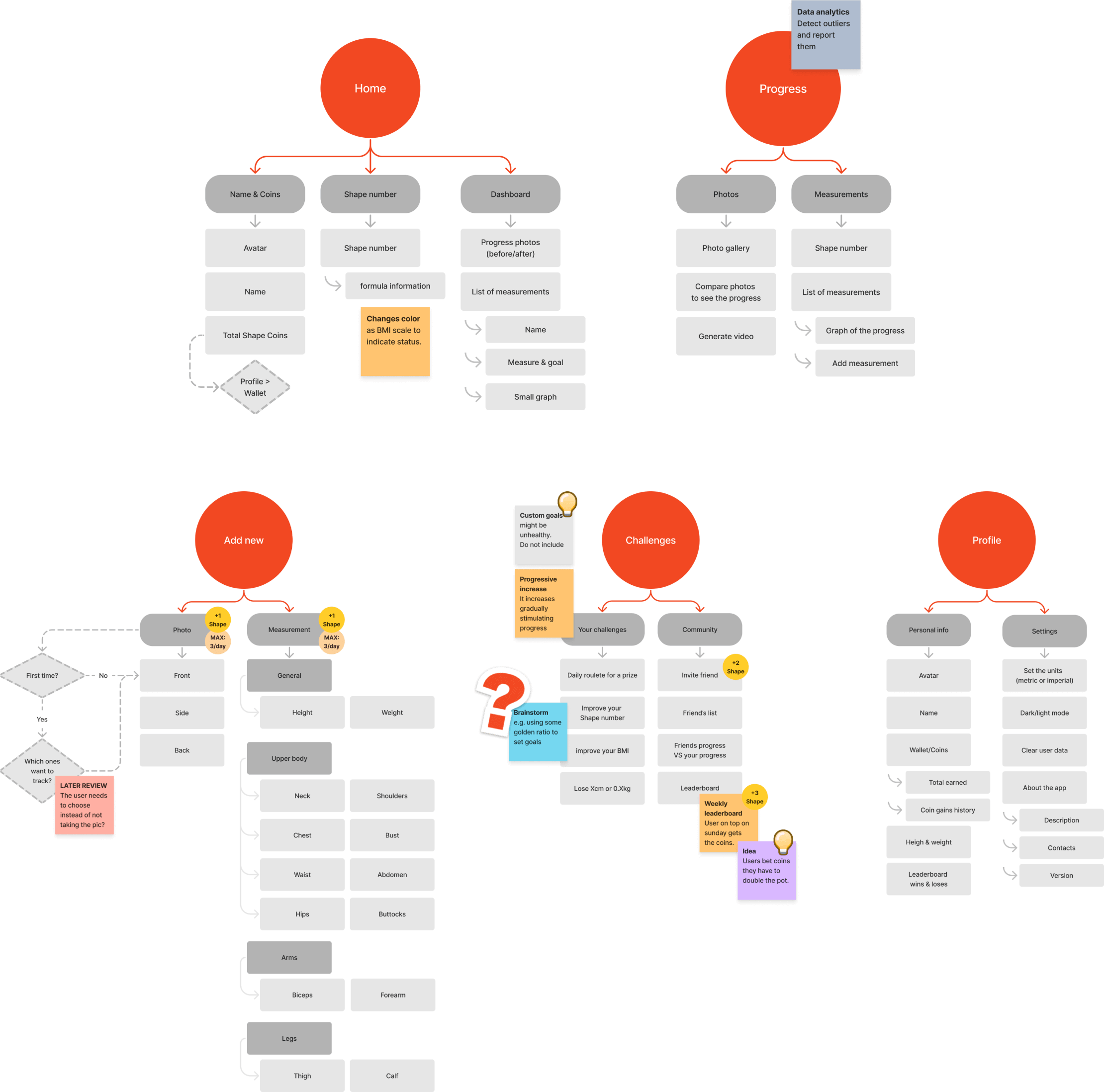
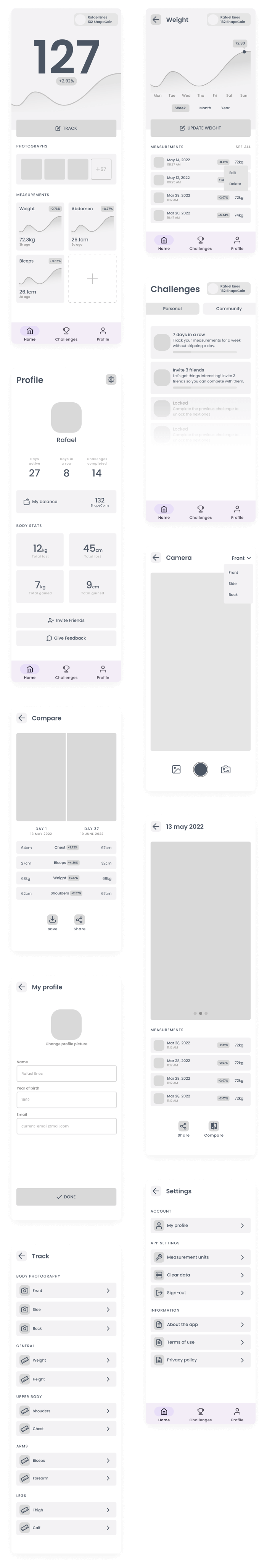
main app sections
We're still thinking divergently and viewing the problem from different angles to come up with distinct solutions. We defined when to reward the users in the journey and how many coins. It's crucial to balance the rewards and prevent usage abuse. To solve this, the number of coins the user can receive a day is limited, and we have data analysis in place to detect outliers.
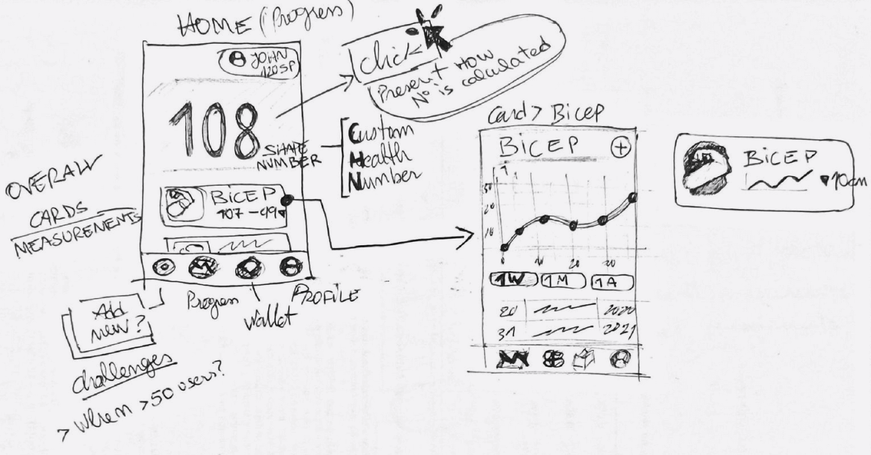
From the planning to the hands dirty in pixels
I always start this phase with a blank sheet of paper. I start envisioning each screen that's represented in the user flows. I start by drawing boxes, and when I feel confident with the results, I get to the computer to refine them.
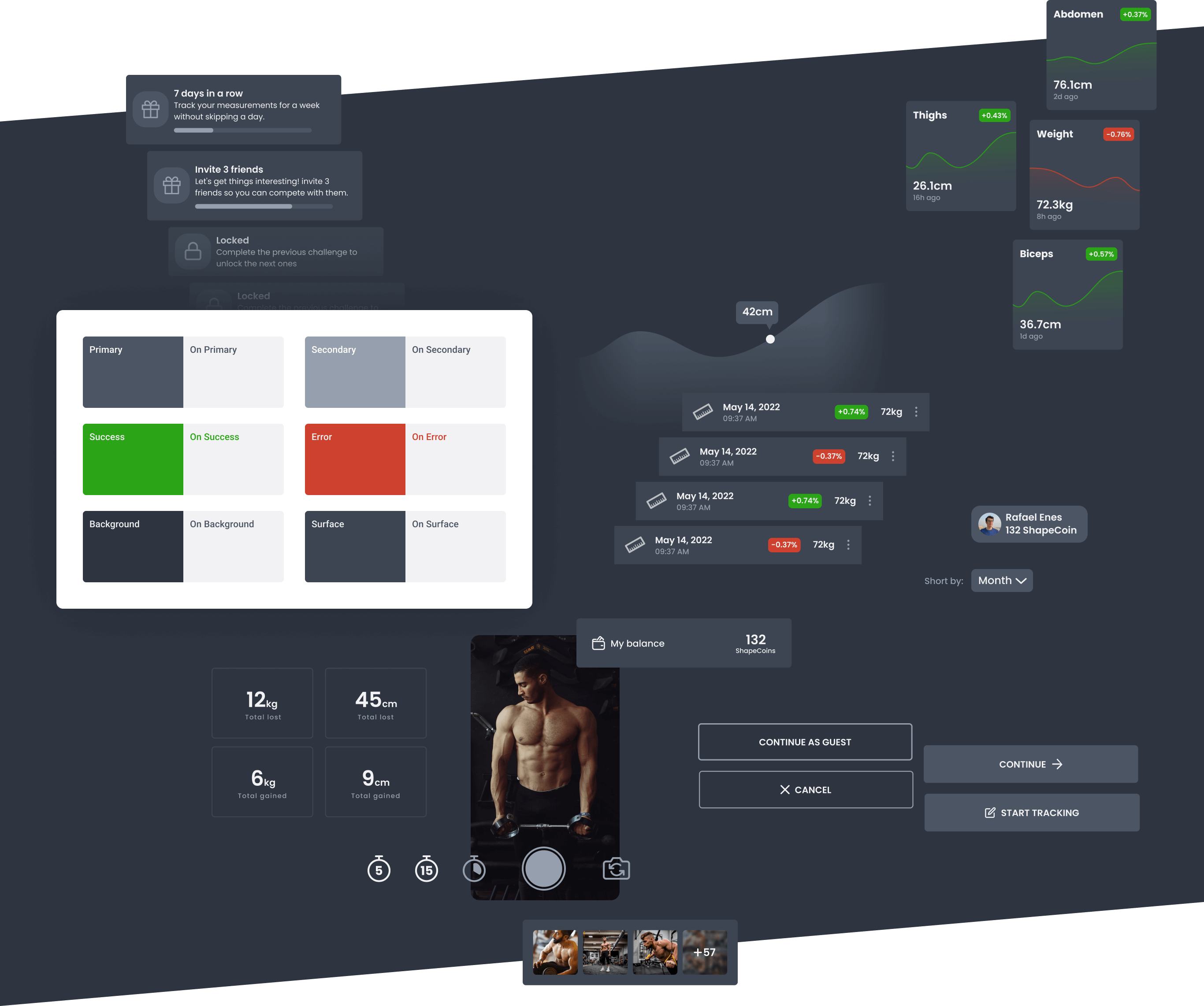
Diving deep into pixels, type and chrome palettes
It's essential not to think in colors and pixels until this phase and to focus on usability, accessibility, and other factors influencing the user experience.
Now that we have defined the information architecture and user journey throughout the app, we can focus on leveling up the user experience by designing a pleasing user interface.
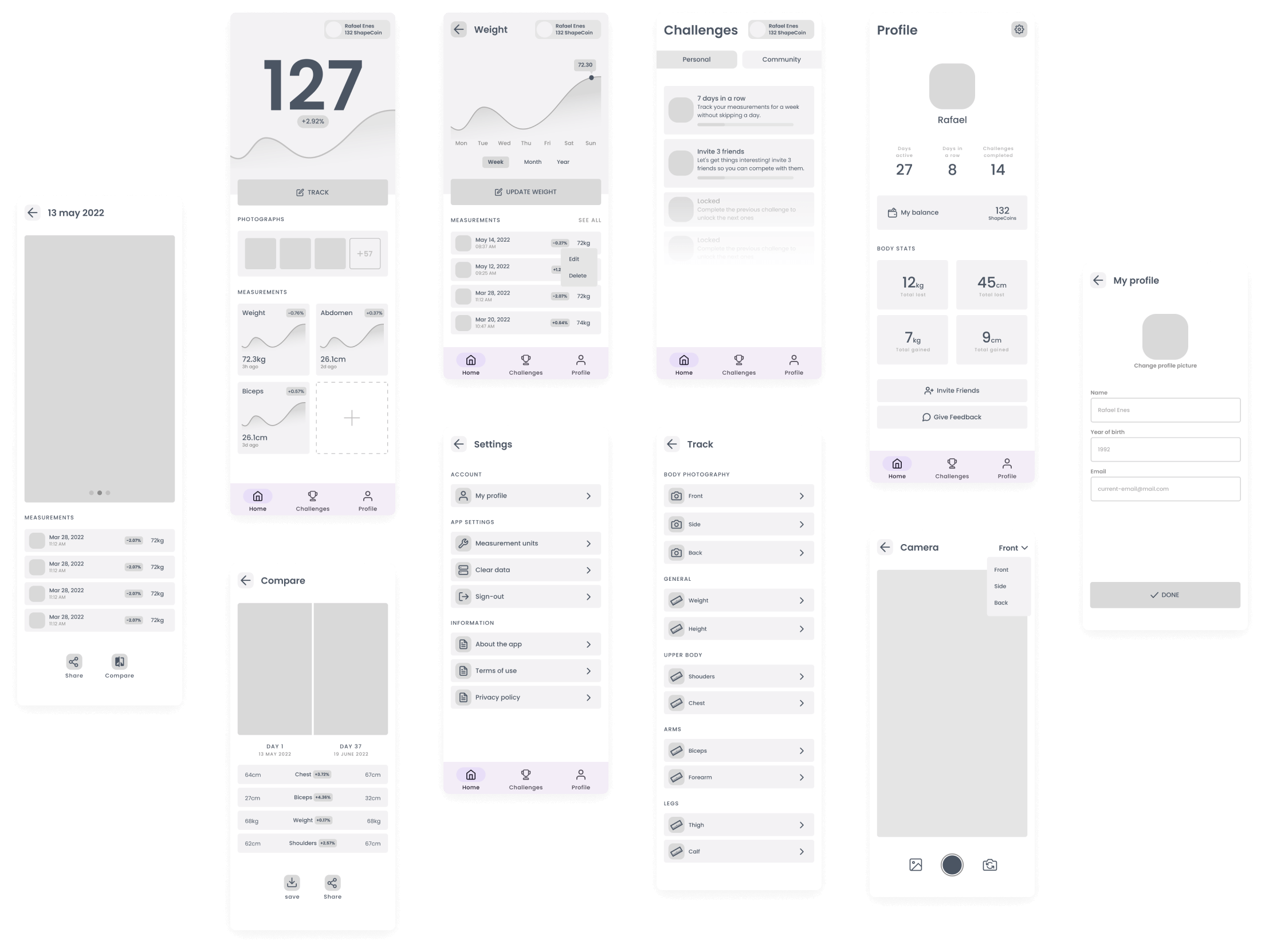
Bringing all together in a high-fidelity prototype
Everything comes together in this phase. The wireframes come to life when receiving the styles of the design system created. This is also an excellent opportunity to check the color combinations in action to see on each screen if they still pass the color contrast accessibility test.
With the high-fidelity prototype, we can start to test the interactions to make the product even more appealing.