Project Overview
In a consumerist and more environmentally conscious society, people continue to upgrade their possessions. Those old and sometimes functional objects will go to trash yards, and some might be ending up on the ocean.
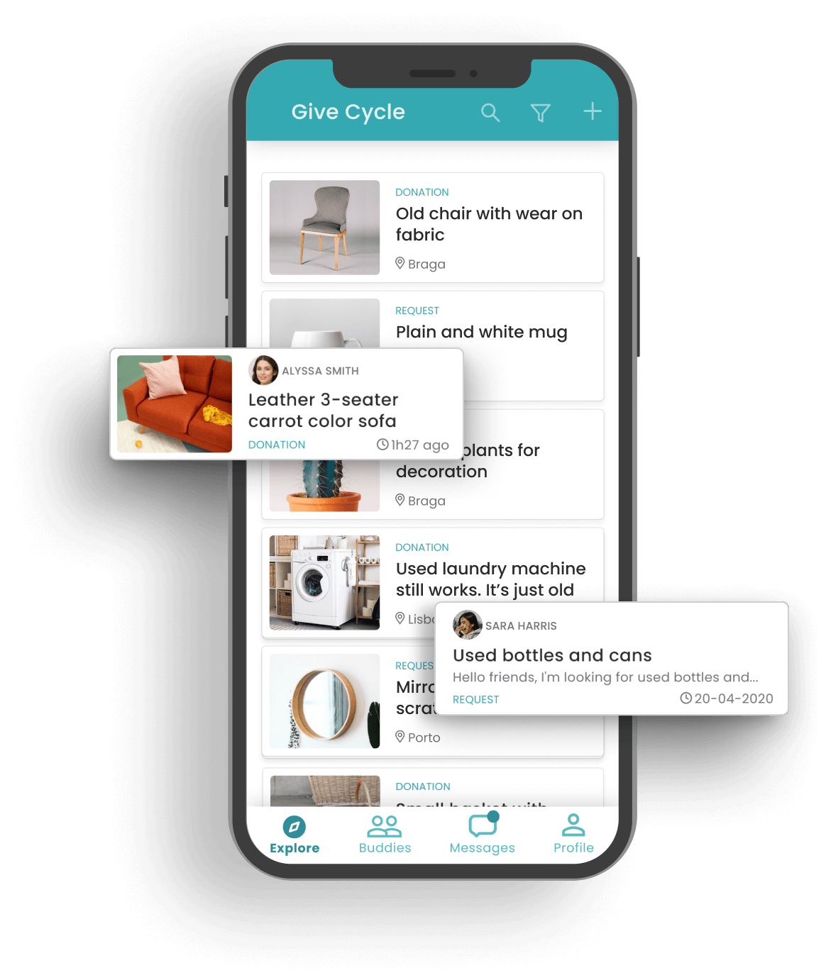
Building an application that allows donation of used products was necessary. That solution also provided a way to connect people, increase solidarity, and reduce unnecessary waste.
The app's goal is to empower the community by helping people recycle their obsolete products.
Discoverying the people’s needs
Putting yourself in the user's shoes is a great way to discover user needs and understand how they would use the app.
Who are the users
It's for environmentally-conscious people who want to upgrade their furniture, electronics or other products and don't know what to do with the old. It's for people with a social conscience who wish to help improve their community and not contribute to the increase of unrecyclable trash.
It's also for people who have low income and need help from the community. Who need essential goods to have good wellbeing.
personas
🧔 Stuart is concerned about the environment and recycling. The main objective is to donate old products that still function well enough. He doesn't feel good to throw them away. He wants to have a clear conscience knowing that someone will reuse his products.
👨🦱 Jack rented an old house because he has a low income and is dissatisfied with some furniture. He doesn't want to throw it away as things are still in good shape. He wants to make exchanges in search of something more suitable.
👩 Emily is an underprivileged person who earns the minimum wage, receives social aid and seeks donations of specific goods she needs.
Planning the app
What started on paper for fast thinking was soon solidified using digital diagram tools. It helped refine the user flow without having to draw it again. Also, color codification offered visual clues to better view the app's logic.
Starting with the logic helps get a birds-eye view of the whole app and how things relate.
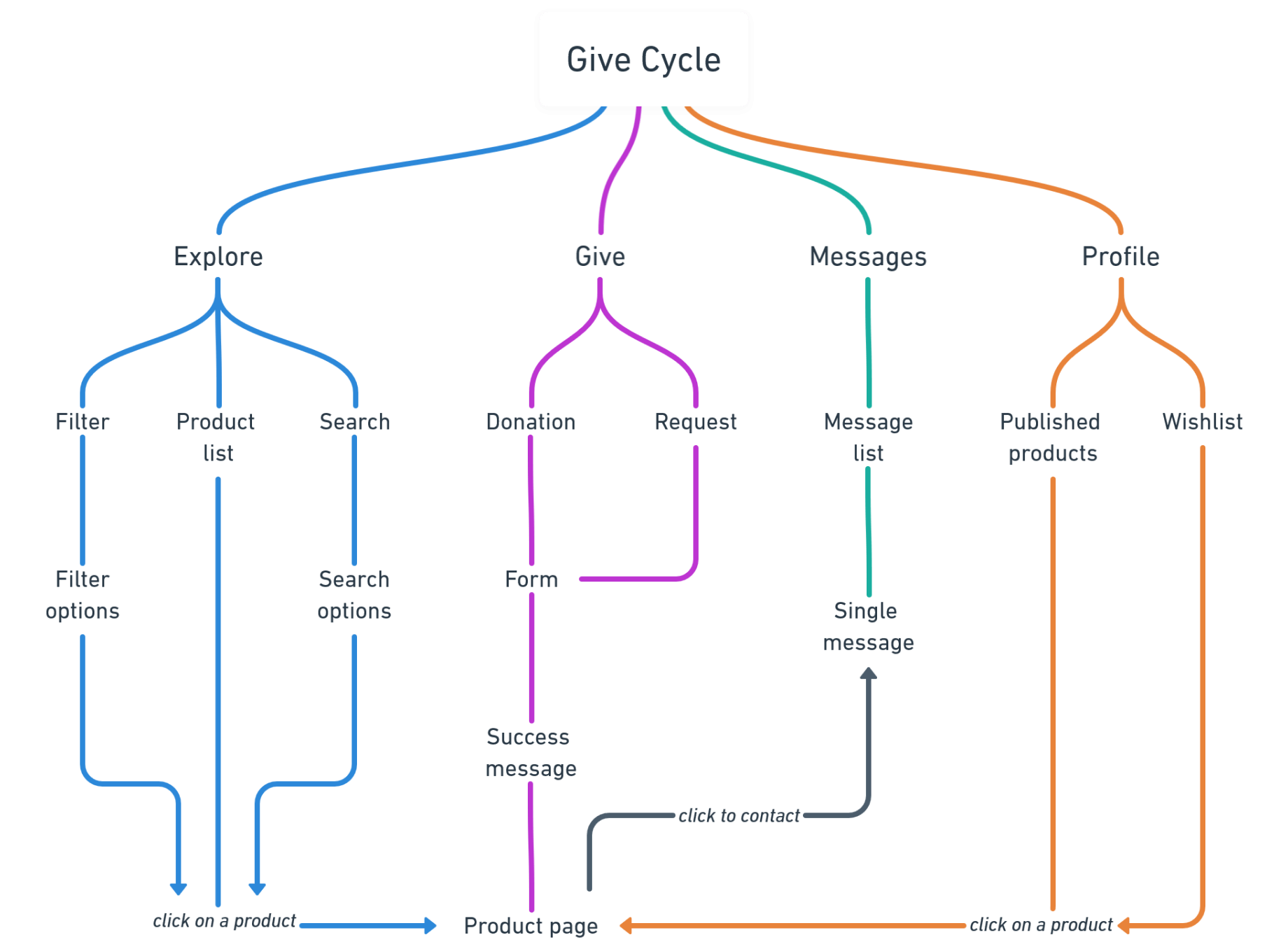
Planning the app
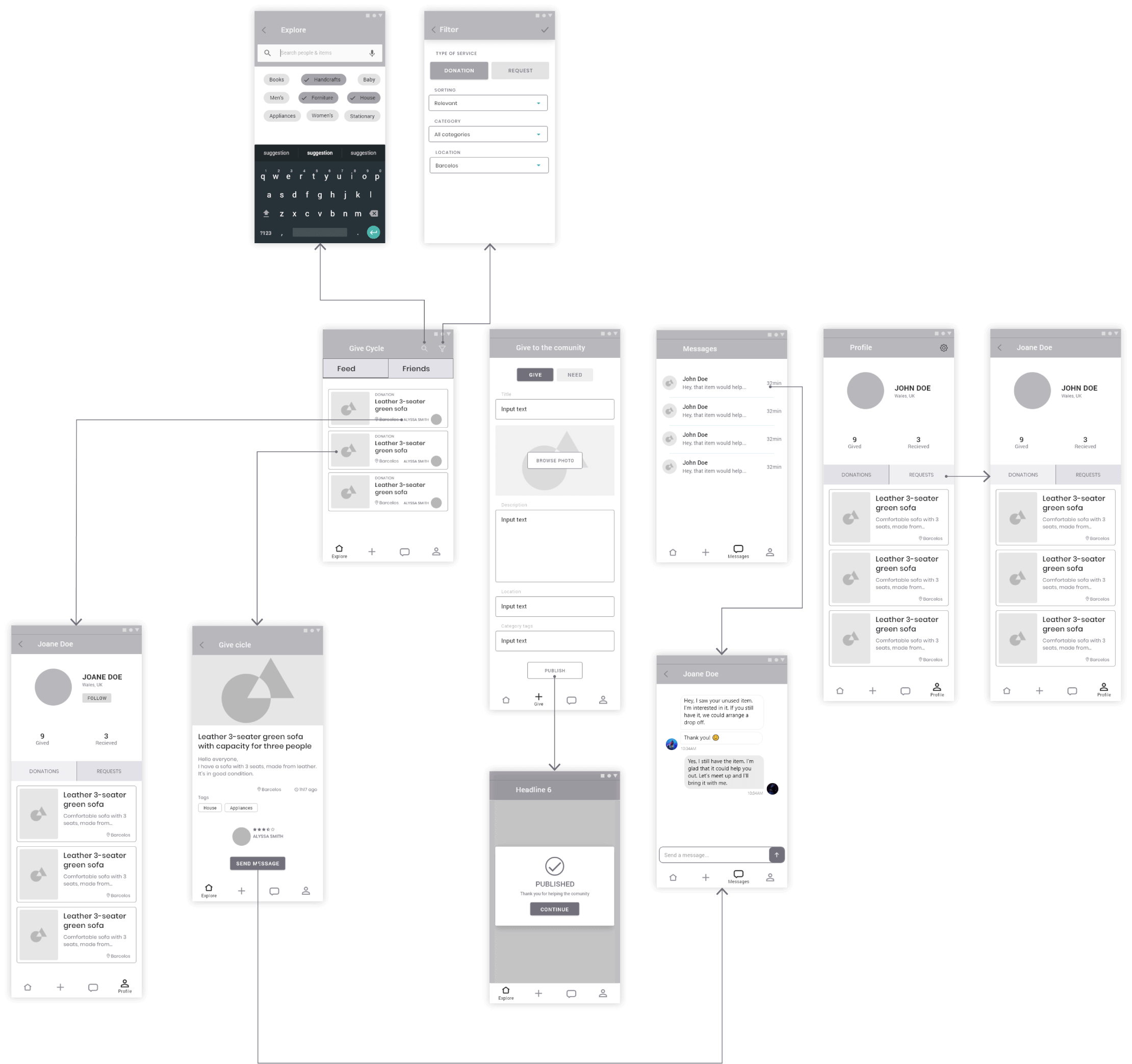
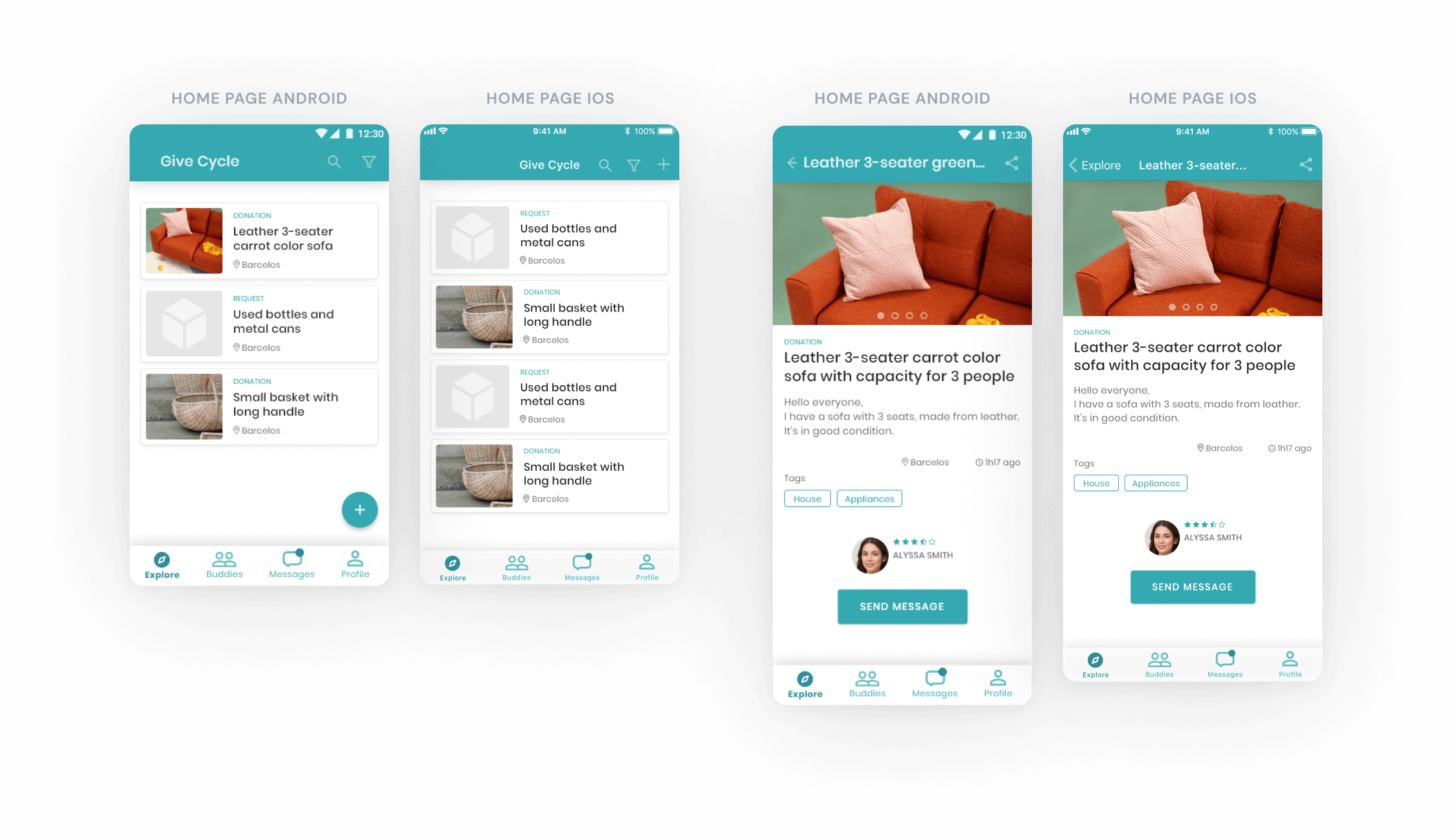
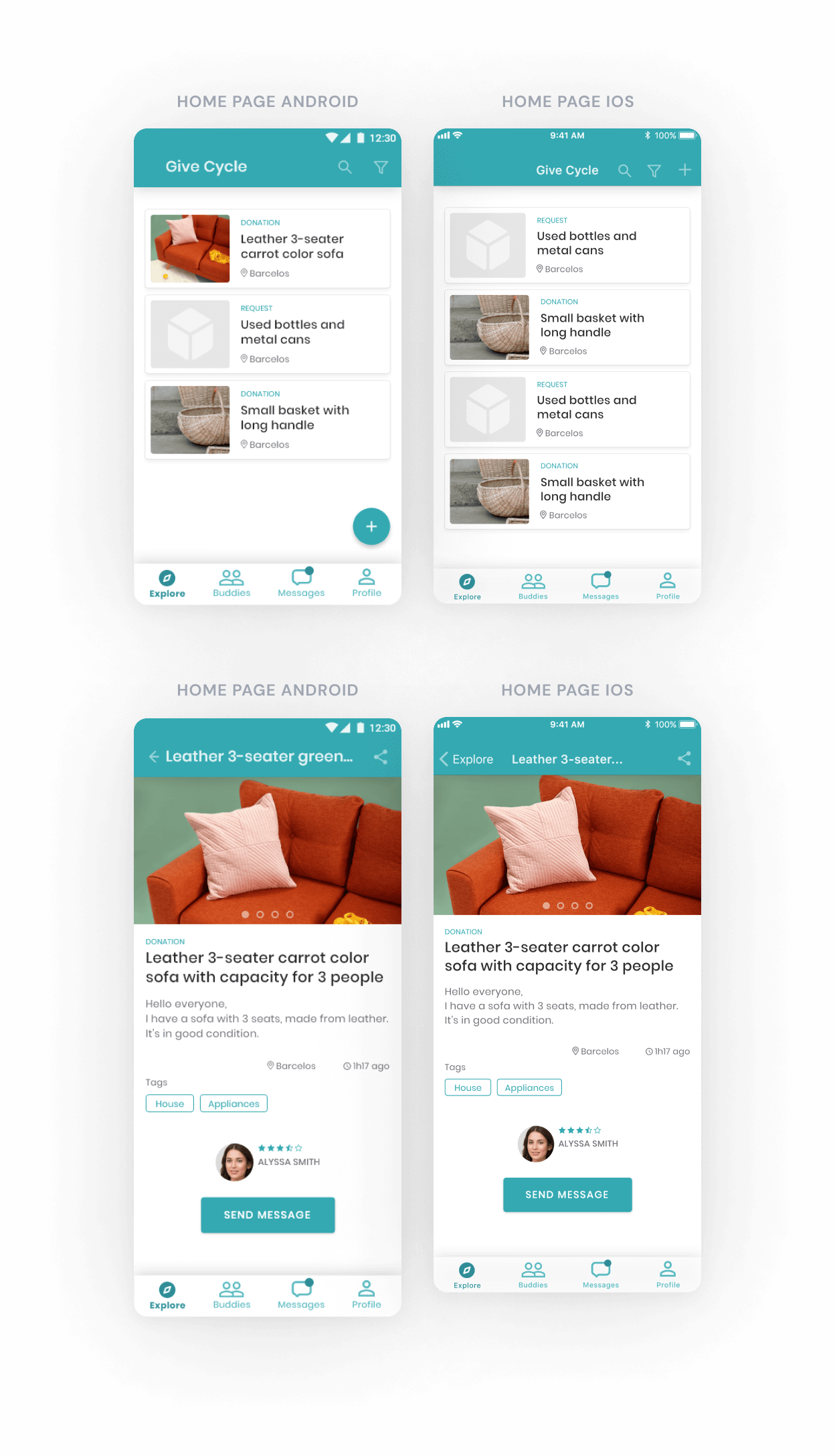
The app needs to be for both Android and iOS. I decided to start the wireframes guided by the Android Material Design Guidelines and then adapt for the Apple Human Interface Guidelines.
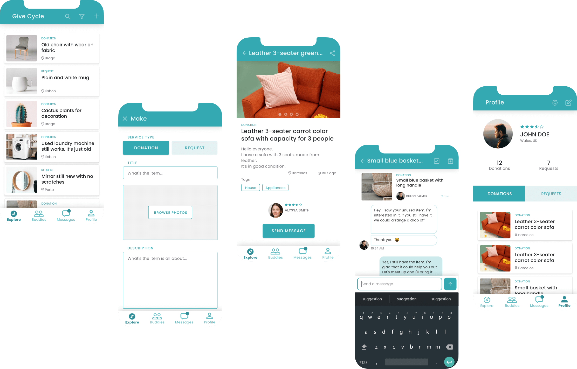
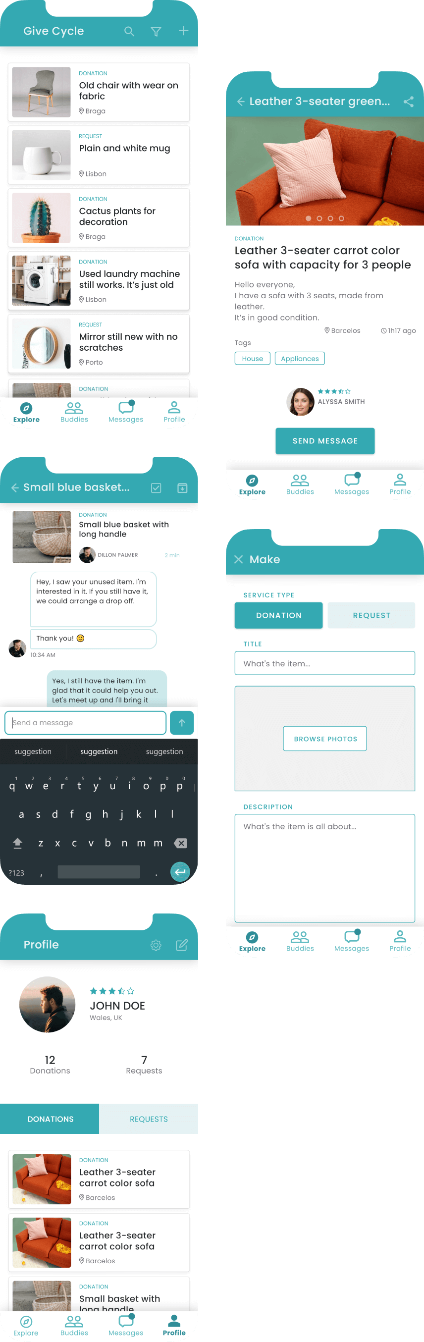
Creating the UI design
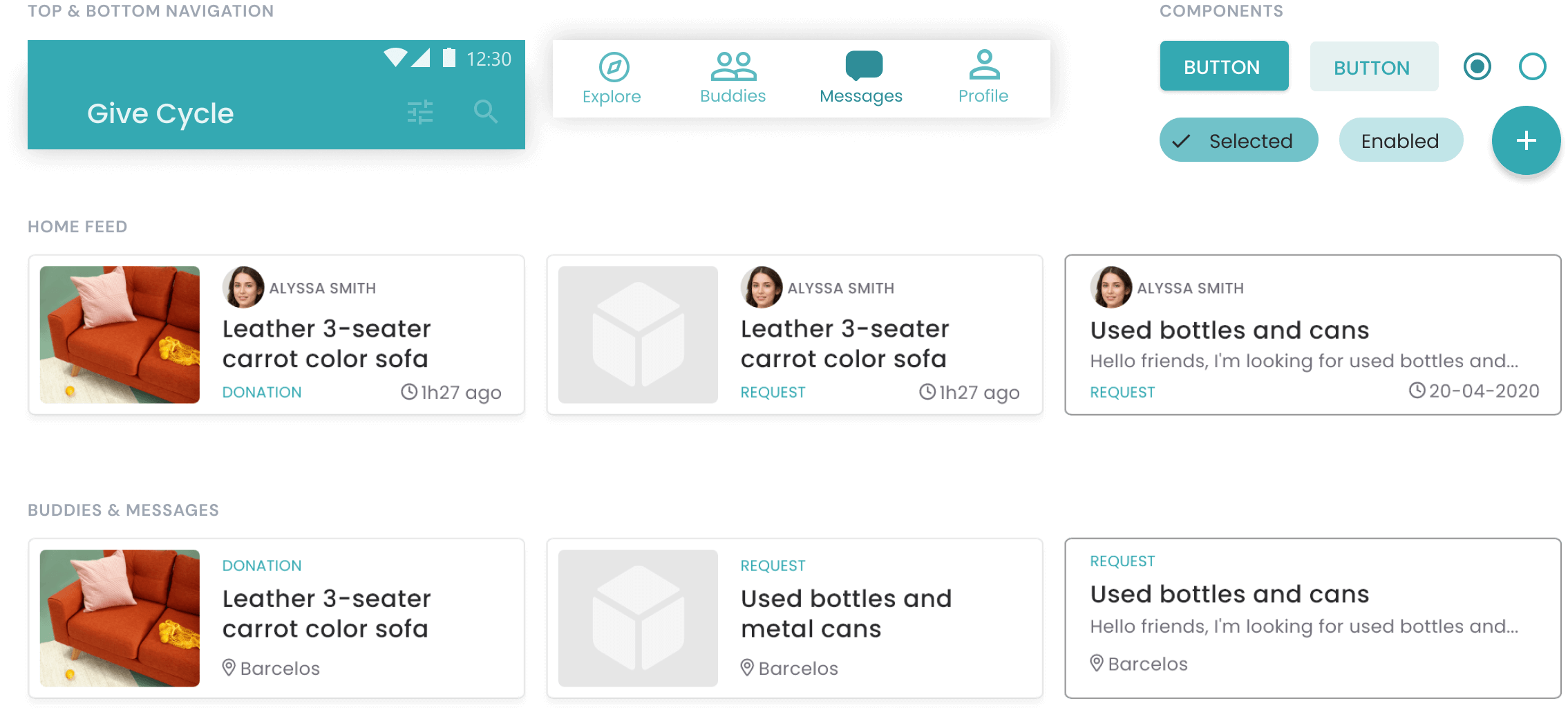
The apps are made of small repeatable components. To develop the UI design more efficiently, I designed master components that can be used in several instances throughout the interface.
Design software facilitates the management of those elements and provides valuable tools for managing design systems. I took advantage of that to build the interface and easily improve it in the next iterations.
It was created an analogous color palette based on green tones. The green color was selected because of earthly meaning and tranquility. It was also selected neutral tones like black or gray for the text to provide an accessible reading experience.
All visual design decisions made had the objective to make the app delicate, friendly, fun and simple to use.
With visual design decisions made, all the building blocks needed were created. Now it was just a matter of building the puzzle.
Android and iOS versions
Since the app is to be used on Android and iOS, some adjustments were needed. I followed the guidelines of both platforms to modify the interface.
It was decided to create the app first for the Android platform because Android phones are the most accessible to low-income people.
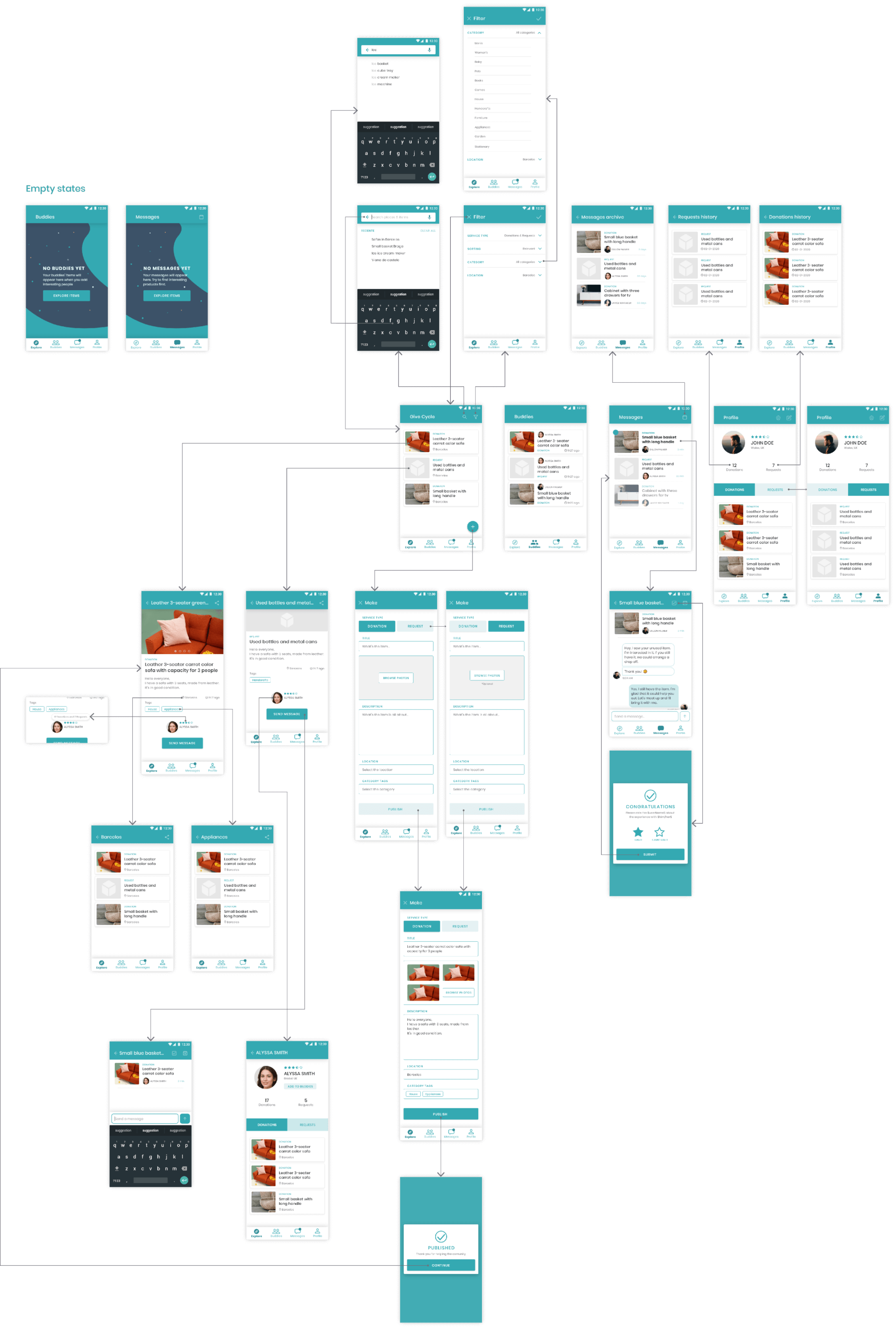
High-fidelity prototyping
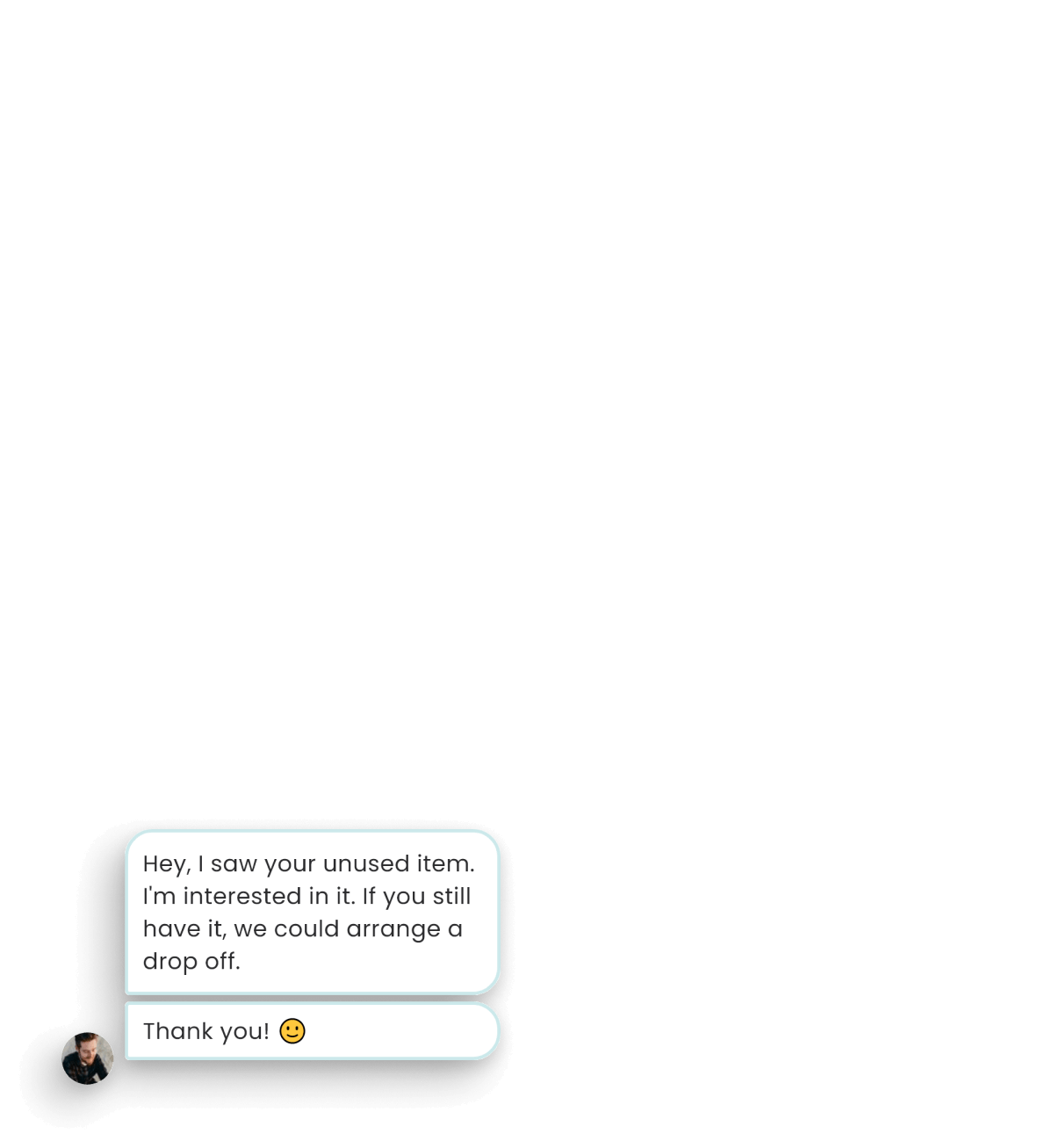
In the prototype, the interface was consolidated. It was designed extra screens like the empty states and thought about animation and micro-interactions.